


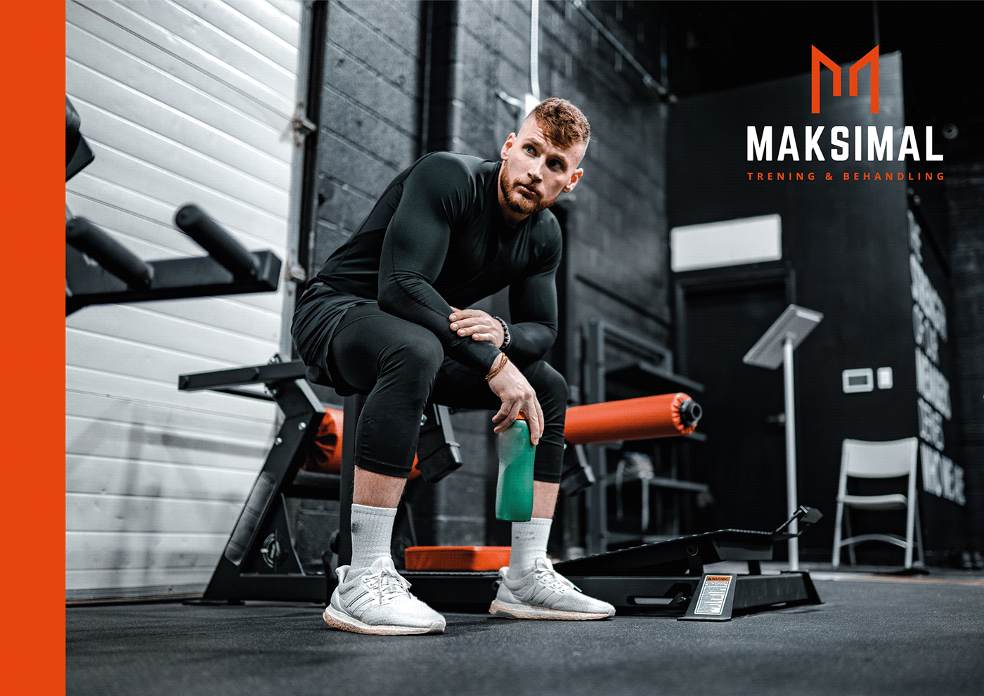


Maksimal offers guided training, chiropractic, physiotherapy, and massage for customers in Oslo. I created their logo and concept.
The logo is inspired by the Ur rune, symbolizing strength, endurance, and transformation. Together, they form an 'M.' This is also representing growth, upward movement, and peak performance—all concepts relevant to a fitness brand.
The use of a dark background with a bright orange for the text and logo creates a strong contrast, ensuring the logo stands out and grabs attention. Orange is associated with energy and vitality, which is fitting for a brand related to training and health.
The font is modern and sans-serif, which conveys a sense of simplicity and strength. It's very readable, which is crucial for brand recognition. The use of capital letters in the brand name adds to the feeling of strength and assertiveness.


